

01 · CRAFTED HERITAGE
Rooted in tradition.
Inspired by the richness of Punjabi craftsmanship, every detail celebrates the artistry, colour and cultural character behind Aafreen.
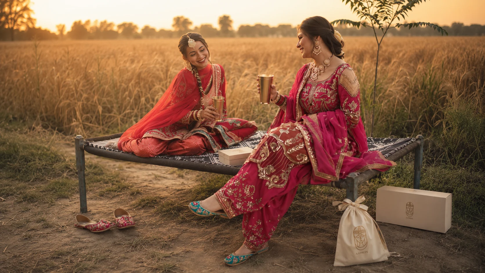
We built Aafreen as a complete premium Punjabi jutti brand — from its queen-led identity to the packaging, copy and digital experience around it. Aafreen needed to feel culturally rooted, visually distinctive and premium enough to stand confidently beside an established fashion studio.

Design brief
Aafreen already had the product and the cultural foundation. Our role was to build the system around it—from identity and packaging to retail touchpoints and digital storytelling.
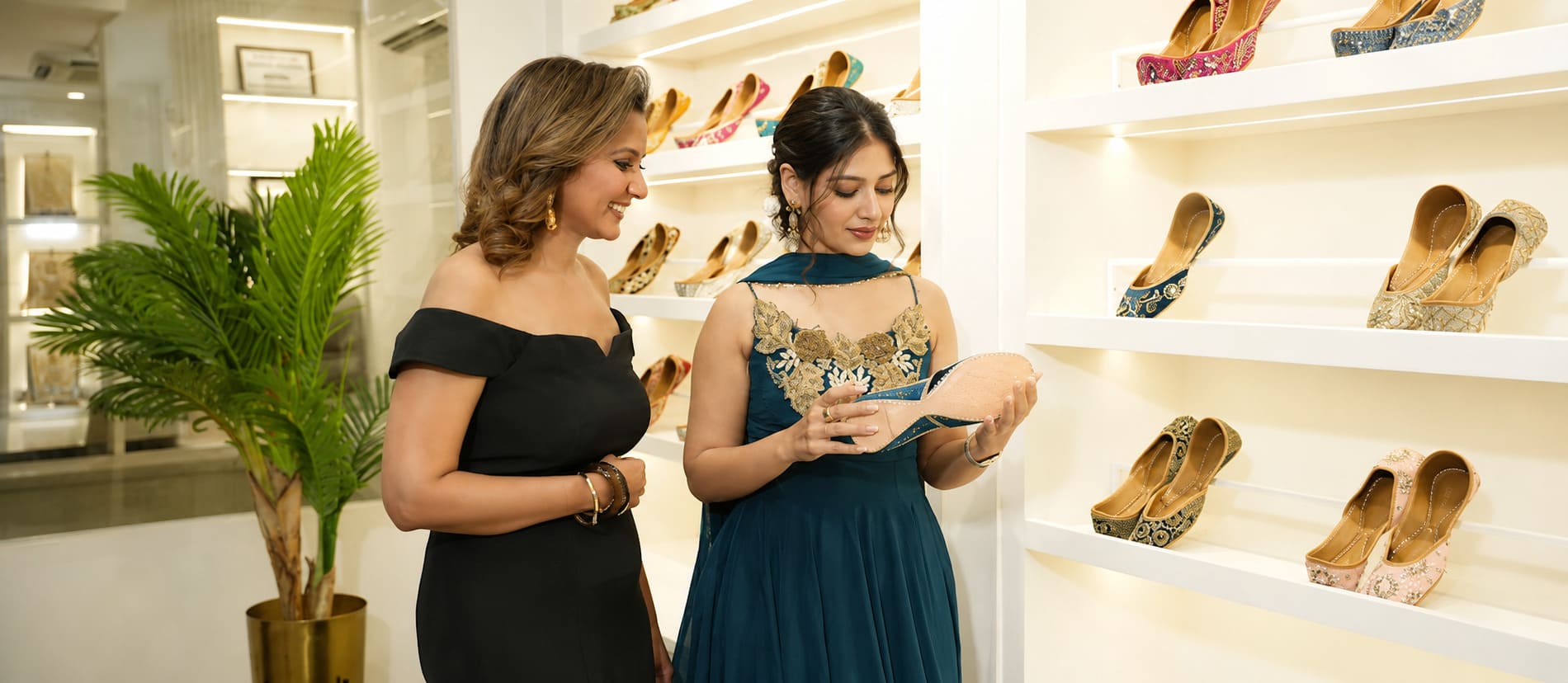
The Logo
Aafreen needed more than a decorative wordmark. It needed a symbol with enough character to create immediate recognition. The final identity was built around a distinctive queen emblem—representing confidence, elegance and the premium woman Aafreen speaks to.


A distinct, composed face created recognition and embodied the premium woman Aafreen speaks to.

Distinctive forms and thoughtful details come together to create a signature Aafreen identity.
The system centres on a composed queen emblem and a restrained wordmark , distinctive enough to own recognition, quiet enough to live across packaging, product and digital.
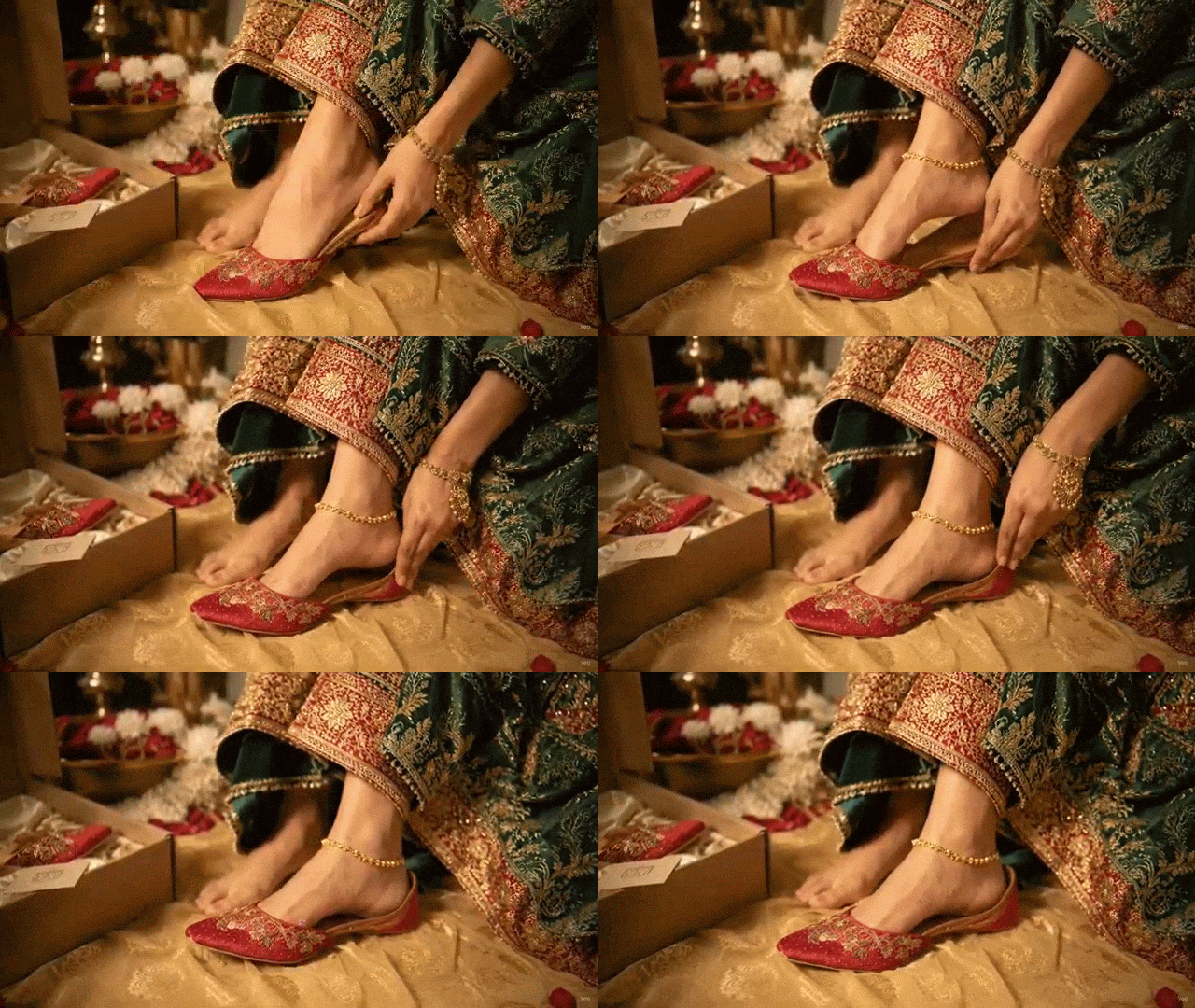
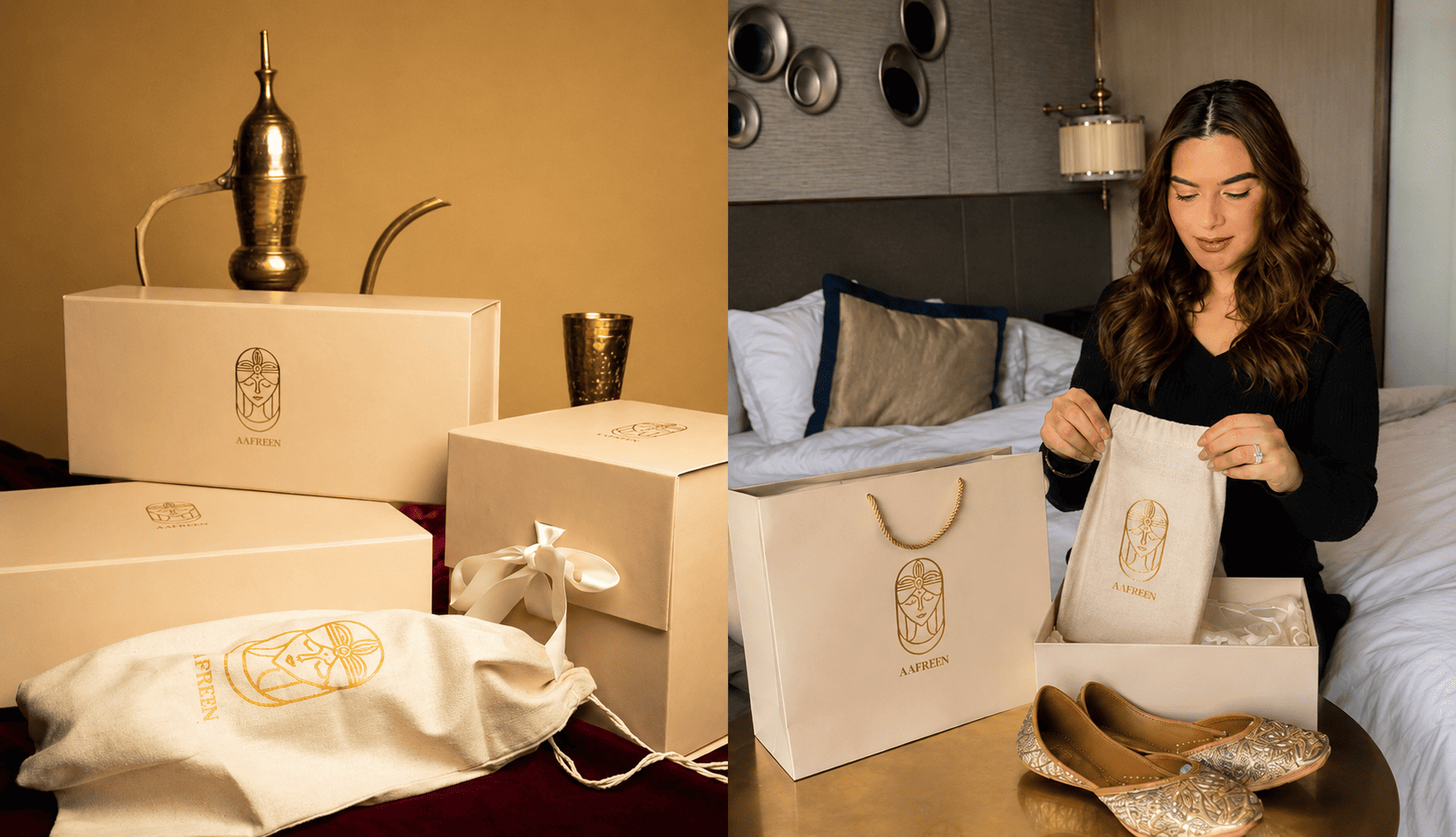
The box, dust bag, thank-you card, inner message and product branding were designed as one experience — so Aafreen felt premium before the footwear was even worn.
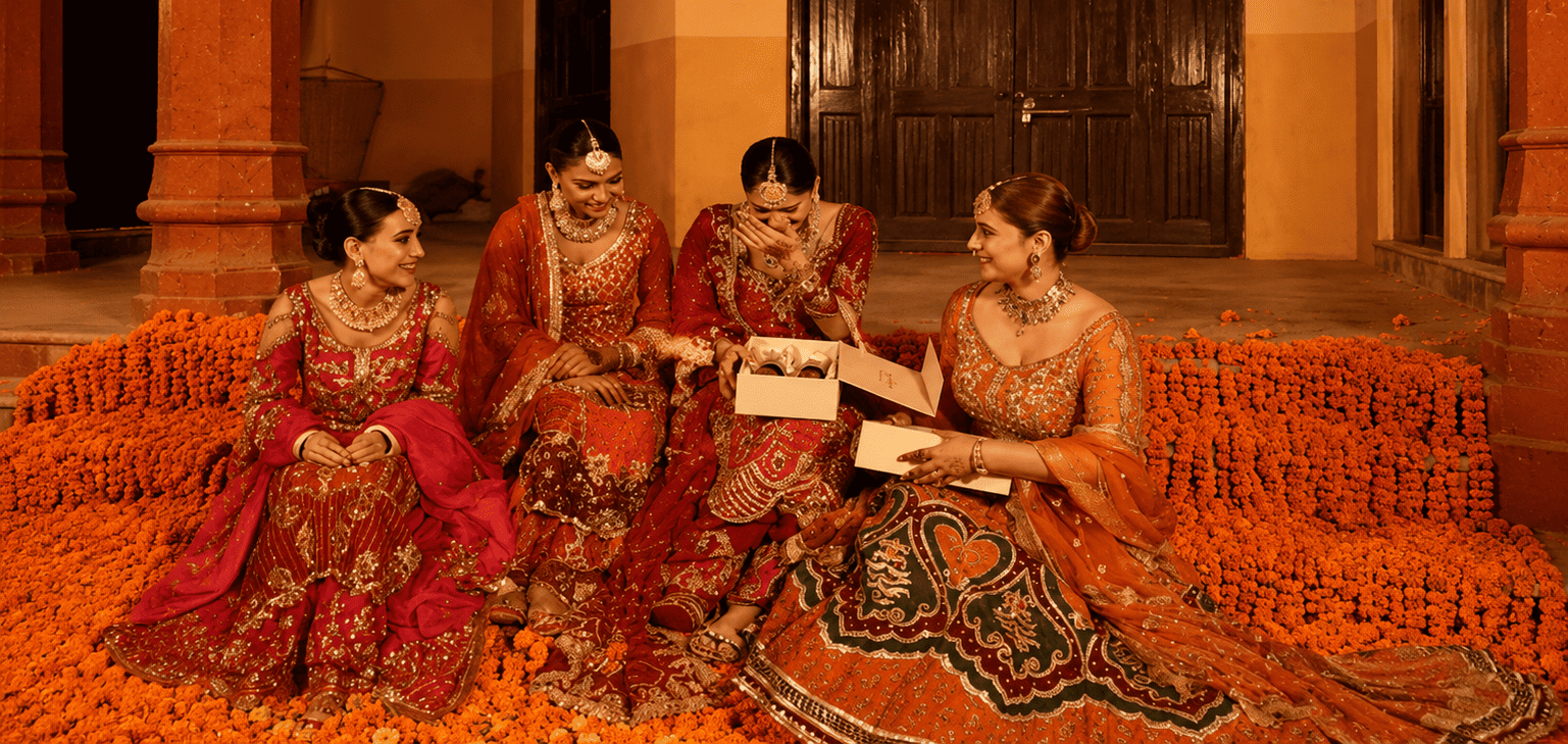
The brand lives inside a specific world: companionship, fields, festive colour and the atmosphere of shared occasions.
Inspired by the richness of Punjabi craftsmanship, every detail celebrates the artistry, colour and cultural character behind Aafreen.

Intricate embroidery, rich textures and thoughtful finishing come together to give every pair its own distinctive presence.
From intimate gatherings to grand celebrations, Aafreen is designed to move with you through the moments worth dressing up for.


More than footwear, each pair becomes part of the occasion—carrying heritage, craftsmanship and confidence with every step.
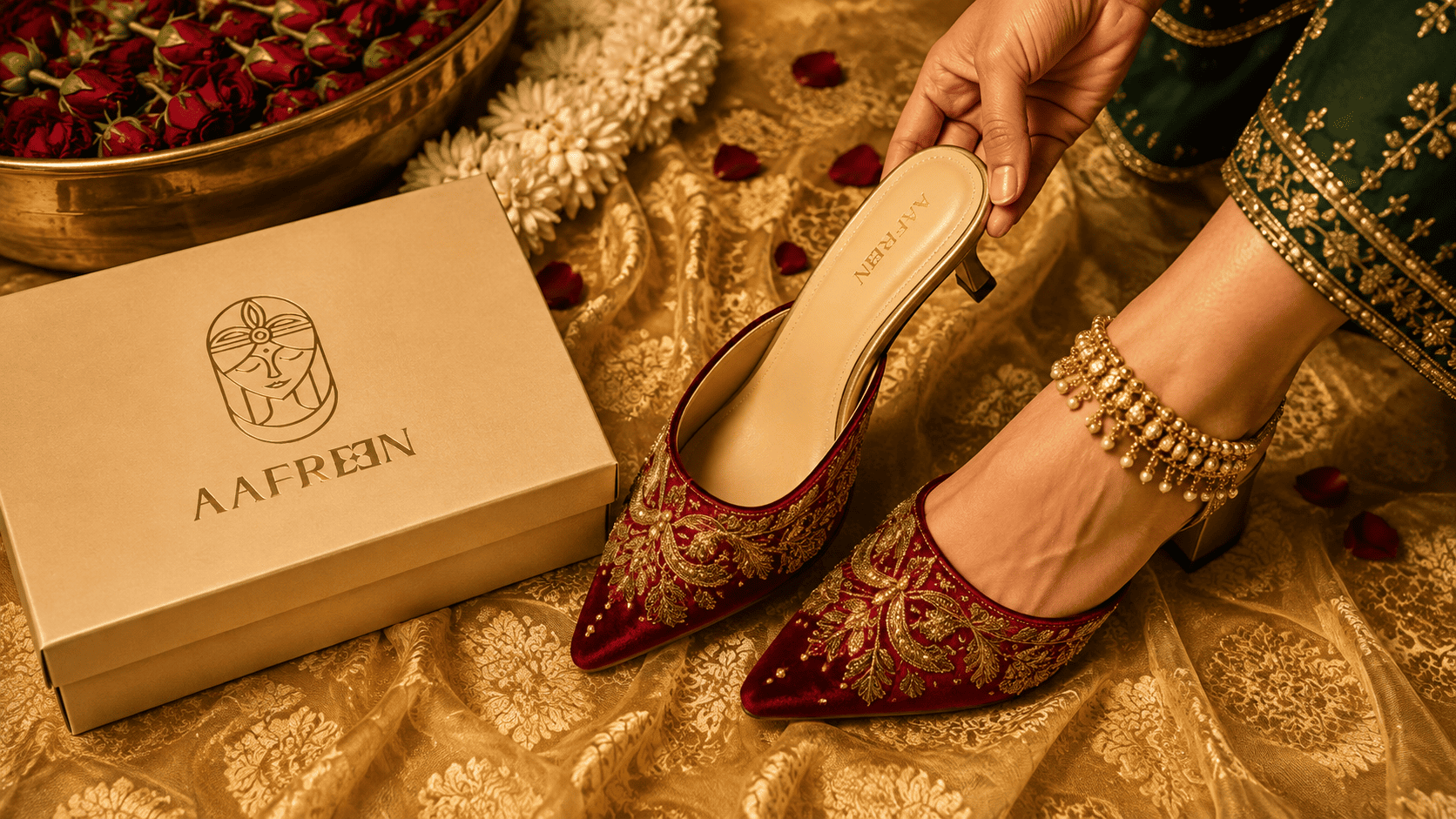
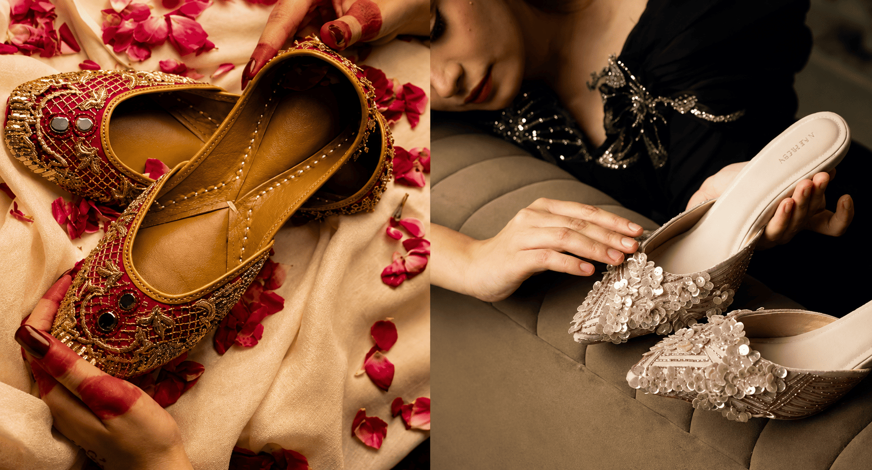
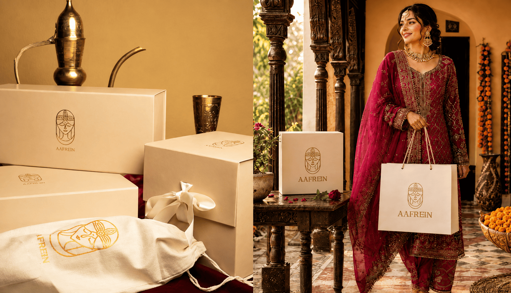
The final system gave the label a memorable face, a richer arrival experience and one coherent presence across store, packaging, product and ecommerce.
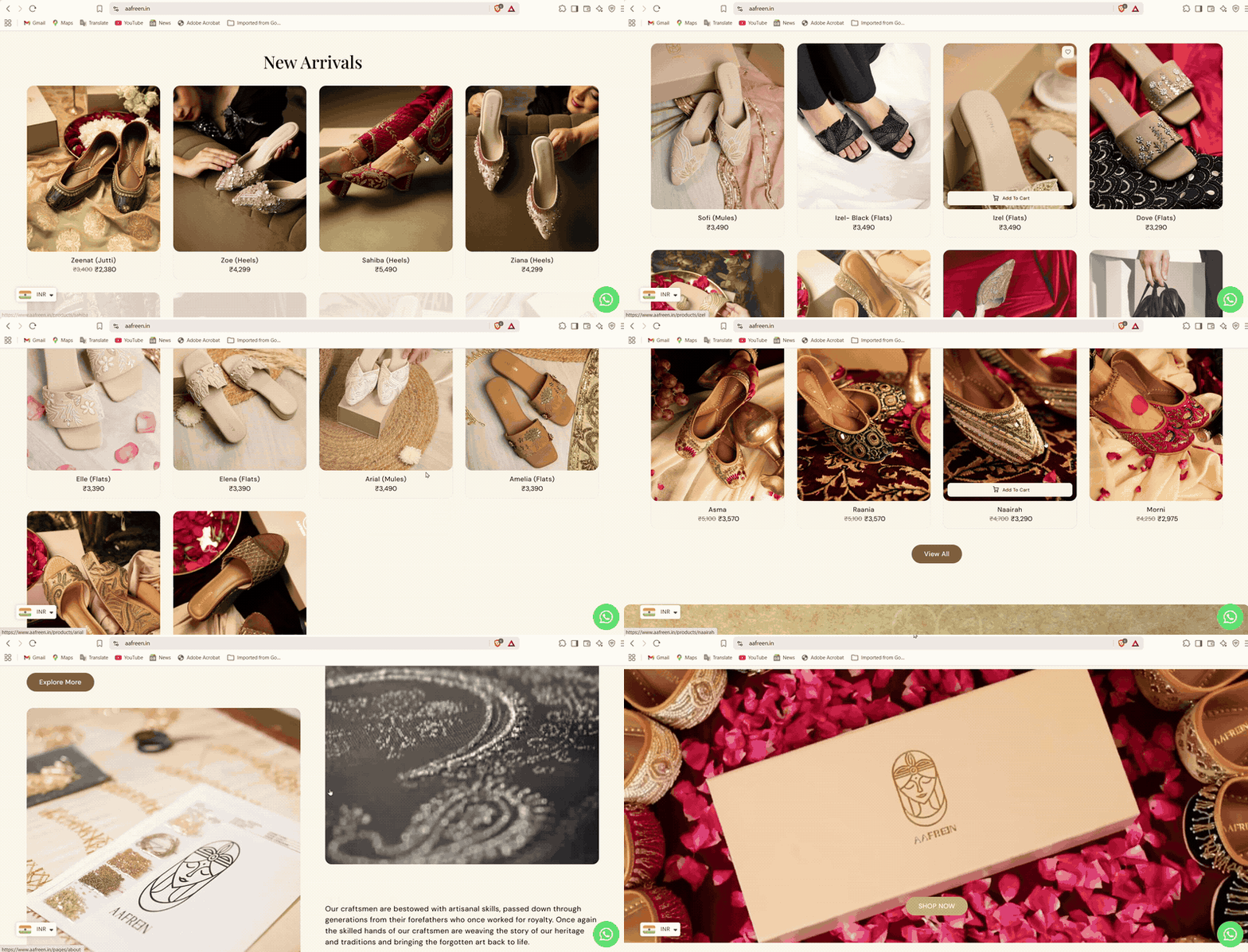
Product discovery stayed clear, but the interface never lost the atmosphere of Aafreen. The homepage led with desire; the story page gave the brand depth.
Clarify product truth, brand story and category context.
Define how the brand should feel and what it should visually own.
Develop the logo, can system and application language.
Visualise the identity across mockups, occasions and materials.
Carry the same clarity and energy into the website experience.
Ready when you are
Tell us about your brand and we will get back to you within one business day